Neovim and to an extent emacs are where corporate IDE vendors go for ideas.
From ergonomics of the UX, performance, portability, design sense (!!) and theming?
It's like Sun and GNU in the 90s. Those UI/UX folks getting pissed their perfect HSL wheel and black balance got dicked with by some PM which is why the GitHub theme is great not legendary?
They go home and rice Arch or NixOS and just shit on the dayjob stuff.
These people are artists, and hacks follow.
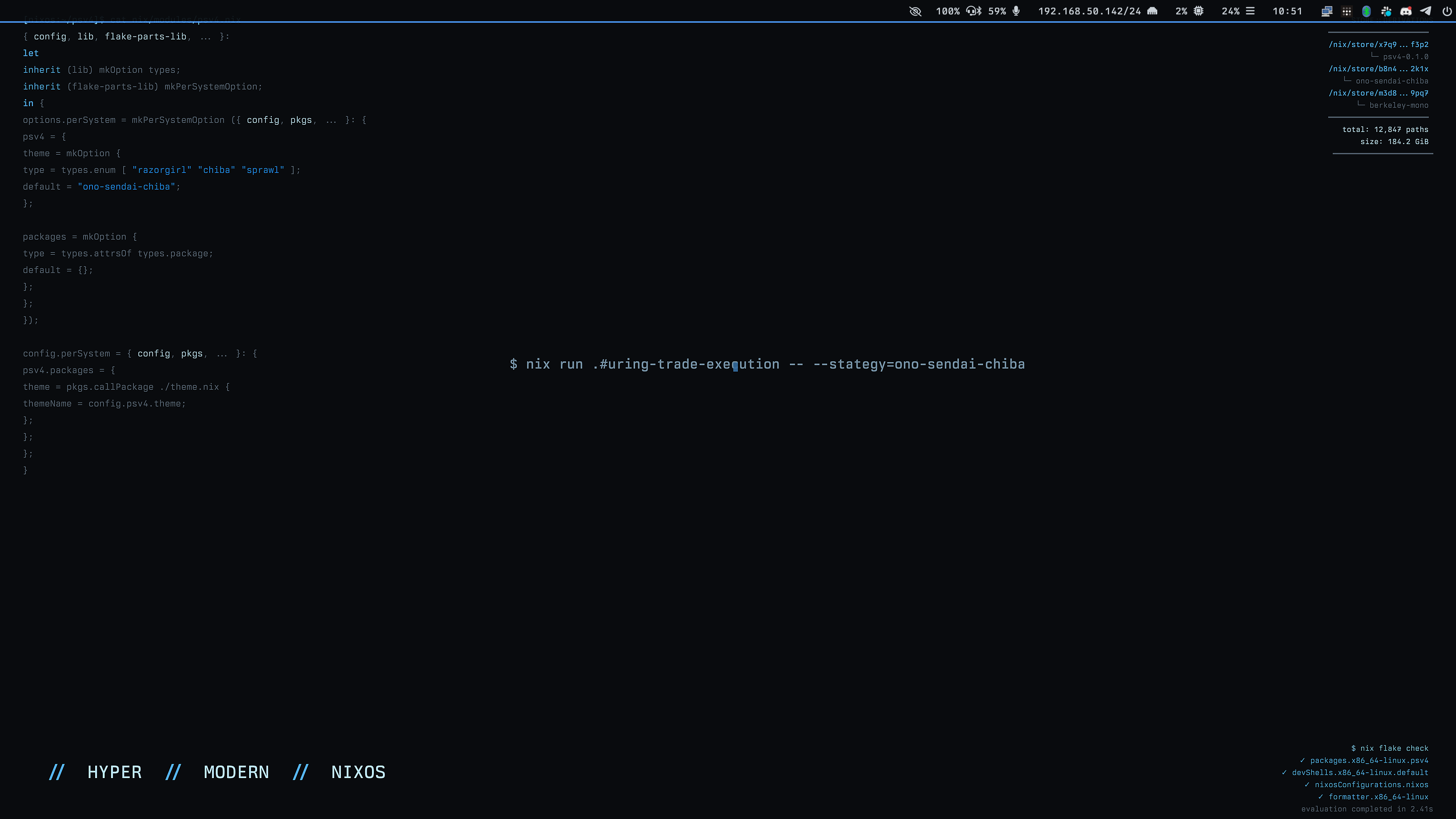
edit: My black balance is calculated on a per-display basis with an HSL-space transform from a hero color by the same NixOS module tree that builds the background from it's own source code as SVG and renders it before downsampling it for the specific display it's on. Of like two people helping beta it, both said roughly "using another desktop is like using the screen at the ATM". DHH is doing something similar with Arch, he's not quite as far along but this is the future.
I don't really understand what you're talking about but it sounds cool. Naive question: what's wrong with just #000000 as black? I often change blacks to that in "dark mode" themes that are actually just dark grey. I want BLACK!
Yeah, I also like being able to get real blacks, and certain kinds of panels can do it (I'm not an expert on panels by any means but I think this is one of the bigger selling points of the OLED family of panel designs is that they can turn off a pixel completely, which let's them get an infinite contrast ratio and therefore pure blacks).
But on a lot of displays (including a couple of the ones I use all the time) the panel can't really do it well, and so there are all kinds of hinting and cheats and other workarounds, and so to get perceptual black, you actually wind up cranking the lum up a little, and that's what I've tried to do with the baseline Ono-Sendai Hypermodern blacks, is give a range of options starting from absolute black, and going up incrementally to GitHub "black"/darkest which is a very expertly designed grayscale (their designers on this are world class), but it's light, it's really high to cope with just about any panel.
If you want to try it out, you can pop these codes into whatever way you set colors:
https://gist.github.com/b7r6/581295d8bb905ef598a05fdf2810a07...
The "Ono-Sendai Memphis" grayscale starts at #000000.
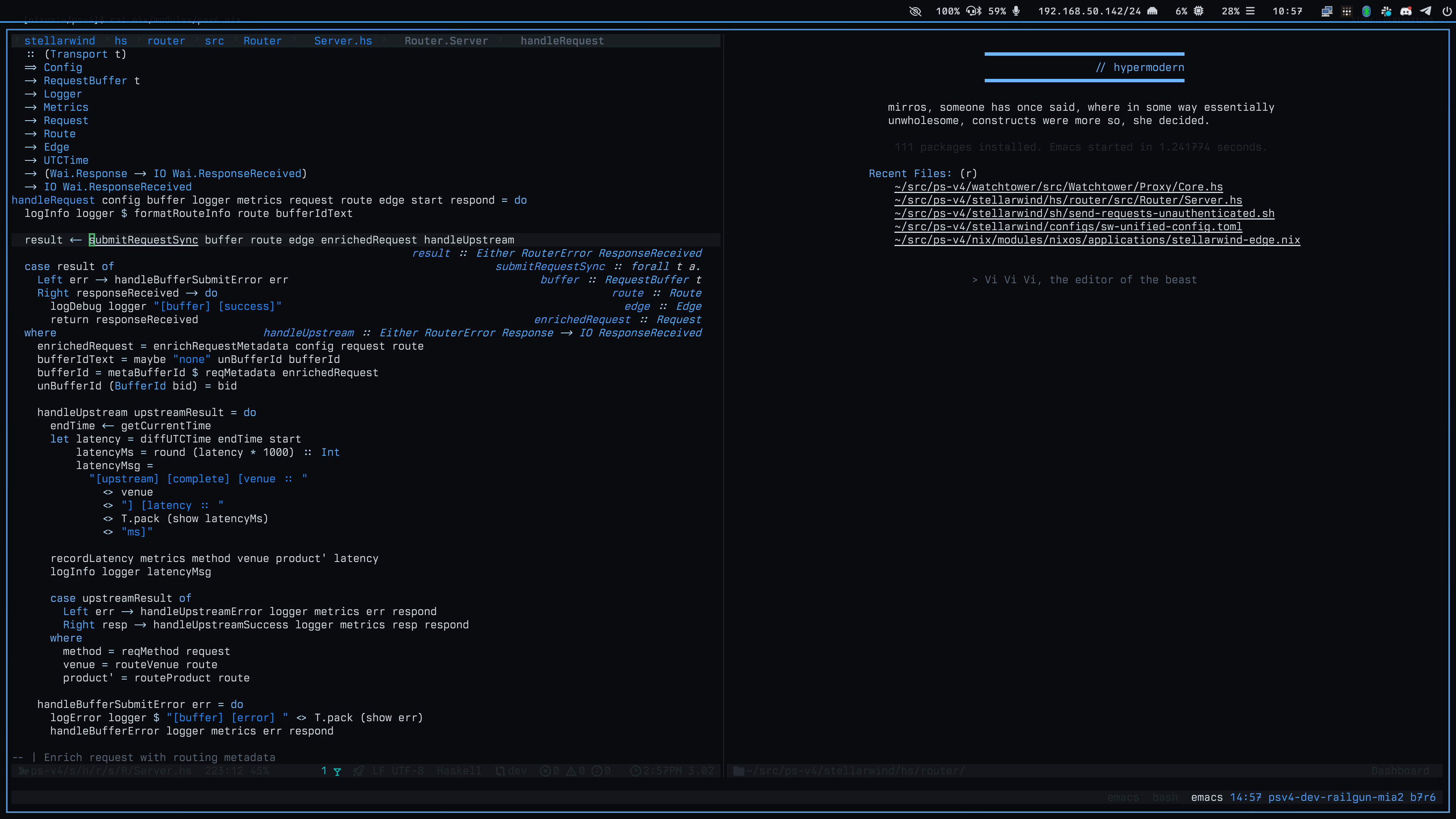
>stellarwind
That sure is a choice of name for your project!
Ha, it's a working title. The name I want for what this will become is `straylight v4`, but that name belongs to a friend, and it has to be a worthy successor to earn being called that. :)
What's that font ?
Berkeley Mono, which I highly recommend if you're into that sort of thing. It's finnicky, has to be hinted right. But the ligatures and stuff are pretty unrivaled IMHO. I think it's like 100 bucks or something, but I bought it once 10 years ago and the license is still good, so it's got an amortization schedule that makes it a perfectly sensible part of a toolbox for a professional if you like myself find it more legible and pleasant than most alternatives.
You must understand that a screenshot of your black balance cannot translate to another screen?
I do understand that. I was just illustrating that it's possible to do very holistically integrated desktops programmatically and in a way where you can do some math once and leverage it again.
I'm personally a fan of `ono-sendai-blue`, but I have a friend in a defense adjacent space and I gather `ono-sendai-tactical` is enjoyed there. The blacks in these reference palettes are a reasonable starting point for many displays, you'll want to hint for your specific one to get optimal outcomes.
https://gist.github.com/b7r6/581295d8bb905ef598a05fdf2810a07...
https://gist.github.com/b7r6/fbbfb1cf2a3d14927bbe621a9050522...
Thank you for clarifying. I opened that screenshot prepared to be amazed by blackness... My mistake ;)
Haha, no worries friend. I find it's just totally counter-intuitive how much difference a little configuration makes relative to the cost of the monitor. Even a relatively inexpensive monitor (I've got like a 200 dollar gaming one that's like an Acer Predator clone and it just looked awful but tuned up it looks great, not as good as my real LG panel but still really good). I never really thought of monitors as something that need a bunch of tuning, but it really makes your dollar go further to get the black balance and subpixel hinting and stuff dialed in. For someone like me who can't afford to just go buy an Apple XDR on a whim, it's worth it.