This blog post sucks. It does not make me want to read the papers.
Look at this figure: https://storage.googleapis.com/gweb-research2023-media/image...
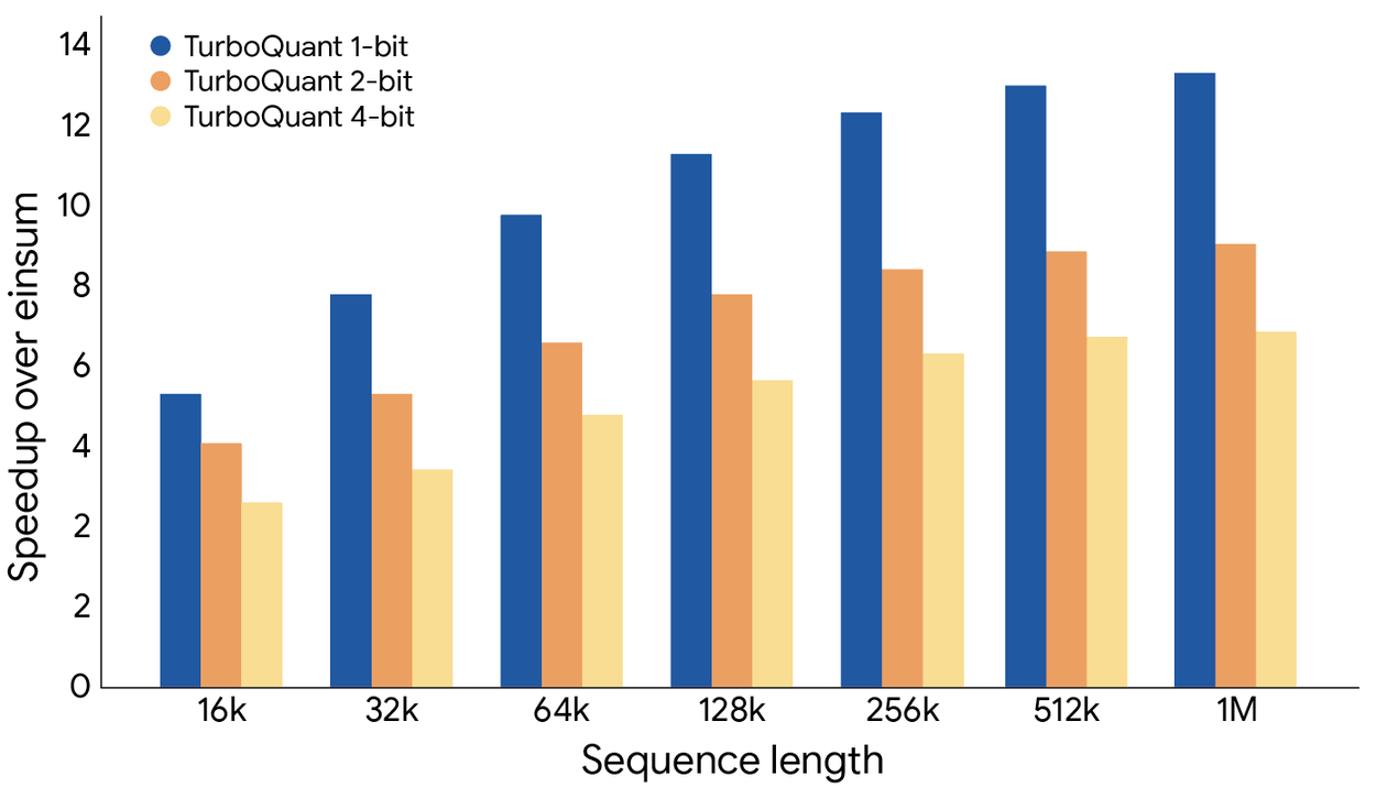
The speedup labels on the vertical axis are 0, 2, 2, 4, 6, 8... Why is 2 repeated? Did they just have nano-banana make them some charts? Can they not be bothered to use matplotlib or bokeh and directly render a graph? I don't know, maybe there is some legitimate reason that I don't know about for making a single value occur multiple times on a graph axes, but if that is the case, then they probably need to explain it in the figure caption. So it's either a "GenAI special" or it's poor communication about how to read the graph...
Look at this video visualization: https://storage.googleapis.com/gweb-research2023-media/media...
Do you have literally any clue what Polar Quantization is? Would this make me think, "I kind of have a high level understanding of that, let me go get the details from the paper."
Look at this figure: https://storage.googleapis.com/gweb-research2023-media/image...
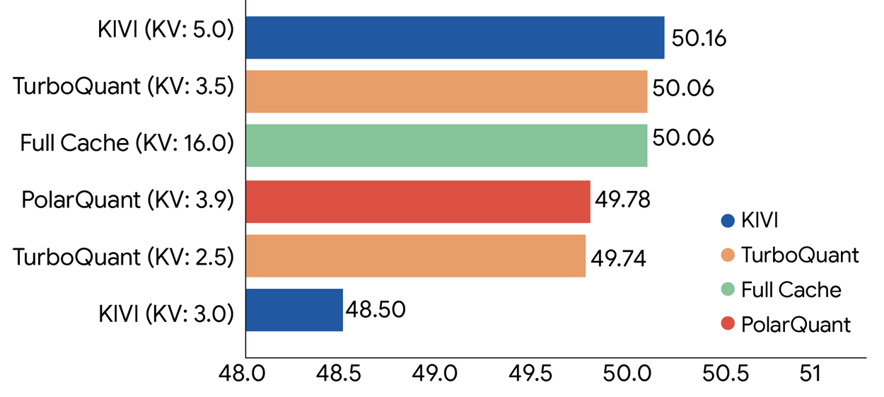
The left hand side of the graph, which is normally assumed to start at 0, starts at 48. Those MASSIVE differences you see in the figure? Only a few percent. And that's a deception but only if the figure is even accurate, because we saw earlier they can't even get figure axes correct.
Yeah, the viz for polar quantization is straight up nonsensical. Okay, so some colors are converted into clocks and then into a bigger box with a pink box inside of it. Got it. Even understanding what polar coordinates are doesn't help you make sense out of it.