Compare to Aqua and Platinum where every resizable window/pane had a big square drag target clearly labeled as such with some diagonal lines:
https://guidebookgallery.org/pics/gui/system/managers/filema...
https://guidebookgallery.org/pics/gui/system/managers/filema...
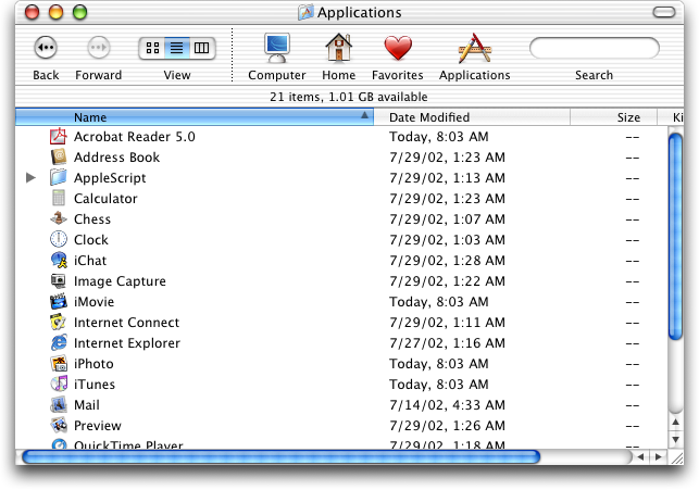
It also - as seen in that screenshot, had large, always visible scrollbars where it was easy to see how far down you were in a folder or document, and could easily click and drag to scroll to where you needed. Now in the service of minimalism we have scrollbars that consist of a thin, semi-transparent line that fades out after half a second and is nearly impossible to click and drag due to how small it is.
> Now in the service of minimalism we have scrollbars that consist of a thin, semi-transparent line that fades out after half a second and is nearly impossible to click and drag due to how small it is.
You can make them always on still. I've done so ever since their disappearing act started. It's not even much hidden, it's in the "Appearance" setting pane.
They're still too small and too light. Some times when a document is big enough I'm actually not able to find the scroll thumb on macOS Sequoia. Some times wiggling the scroll thumb around by scrolling slightly back and forth with my mousewheel/trackpad helps to make it visually appear, but other times I just have to give up.
Also I've noticed sometimes things don't even work correctly with "always on". Some developers don't test it because it's not the default.
These developers also haven't bothered to test with any mouse other than an Apple Trackpad, which turns the scrollbars on by default.
Of course we all make mistakes, but anyone who has made this mistake should really fix it!
The default modality changed.
Classic Macs were designed for the mouse or trackball. Modern Macs are designed for multitouch scrolling. When it's easy to get the scrolling infrastructure on demand, the desktop might not need the same click-first affordances.
In the Aqua image the big bright blue scrollbars stand out far, far more than the content. That sucks, honestly. So does the percentage of the screen dedicated to their presence.
Also, horizontal scrollbars suck. One thing later version of Finder did well was adjust columns to minimize the presence of them.
We just don't need UI that big anymore. These days our cursors are much more accurate, from the magical Mac trackpad to high DPI optical mice, and we're 40+ years into GUIs so the limited number of people who opt-in to a full computing experience can already be expected to know the basics.
Yes Tahoe sucks, but going back to Aqua or classic MacOS would also suck, just in a different direction. If you actually spend time using classic MacOS and Aqua these days, man is it frustrating to get basic things done. Everything is so slow and you're constantly resizing windows to see whats in them. I own several Macs from the 80s-00s and they are really in need of many quality of life updates that later MacOS revs added. On a modern Mac, enabling 'show scrollbars' gets you to a pretty optimal Finder experience, minus all the stupid Mac bugs and Tahoe nonsense like this article points out.
It should be noted the drag handle was removed back in Lion. And the square cutout was removed in Panther, both of which were iterations of Aqua.
(and yes Lion was garbage, first upgrade I skipped since Tiger, and definitely the first "what the fuck are they doing").
Going back to Lion would almost feel like bliss compared to Tahoe. Hell, bliss compared to Big Sur.
Note that downside: you could only resize from that bottom right corner, not from any other edge!
I do think that was better overall, and it's something I miss about Snow Leopard, but I can see why they changed it.
https://news.ycombinator.com/item?id=46581813
Better in that it was clear, but worse that you had to resize from the bottom right. Made expanding to the left, or up, very annoying. I'd take the current situation over this.
True, but not a 1:1 comparison, because Classic Mac OS windows were much better at staying where you put them, even between sessions. John Siracusa wrote a lot about how this was missing from Mac OS X: https://arstechnica.com/gadgets/2003/04/finder/
People also didn't regularly plug classic Macs into external monitors, changing the screen resolution temporarily.
For this and many other reasons, I just don't think the paradigm would work today. It's philosophically smart but limiting in too many other ways.
Yeah that is also true. I have had that experience with certain CD-ROMs (maybe like two or three ever but has happened) on my PowerBook 2400c. If the authoring machine had a higher display resolution than my machine, and the author had the writable disc image's window open to a place outside my screen resolution, and the window positions got saved to the DesktopDB/DesktopDF, and the DesktopDB/DesktopDF got written to the CD-ROM, then it would open in the position outside my screen resolution every time my own DesktopDB/DesktopDF got erased. One particular artist's CD-ROM is completely outside of it which annoys me every time.
Relevant TA: https://web.archive.org/web/20090625152558/http://support.ap...
Windows also used to have a "grip" indicator. Nowadays I only see this in resziable textboxes in browsers...