As much as I like to reminisce about the good old days, I'm not sure the thesis is entirely true. In the 1990s, home computers were more conspicuous, but we didn't really have such a variety of designs. Almost every PC-compatible computer looked the same: a beige plastic monolith. Most corded phones looked the same, most TVs looked the same, most film cameras looked the same, etc.
Now that we look at the designs from 20-30 years ago, they stand out simply because they're outdated. In another 20-30 years, someone will write an article about the beauty of "glass slab" phones of the 2020s.
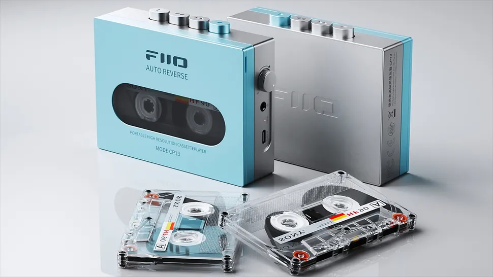
We also tend to cherry-pick outliers. You can find some beautiful designs in every decade, but they're not necessarily representative of everyday life. There's a modern-day company making portable cassette players that look like this:
https://cdn.mos.cms.futurecdn.net/MfFjHvcZjFzZLRPa4p7QZm-970...
Striking and prize-worthy, but not how we roll.
Counterpoint for the 2000s era https://www.google.com/search?q=frutiger+aero+pc+1990s+2000s...
The Frutiger Aero aesthetic was a colourful blip in a sea of beige, and was a brief signifier of wealth and status - a watery and glassy spin-off of 80s Memphis.
Aside from that, the trend in tech always been functional geometric modernism - predominantly black, white, grey, and beige, with occasional very controlled splash colours, predominantly straight lines, rectangles, circles, and simple curves, predominantly an implied or explicit grid.
It doesn't matter if you're looking at cars, synths, computers, offices, or cafes - it's all the same design language. Organic elements in spaces are limited to wood panelling (for status, as always) and verrrry occasionally some tame plants or trees.
There are no organic or chaotic elements in mainstream industrial design. Everything is very carefully controlled, sometimes literally down to the last micron.
Half of those are the same outlier iMac (note, from the 90s) as in the original article, and the rest are indeed grey boxes?